What Your Landing Page Formatting Has to Do With Ugly Pizza
This post is part of SNAP’s free 5-email Landing Page Optimization Series. Sign up here.
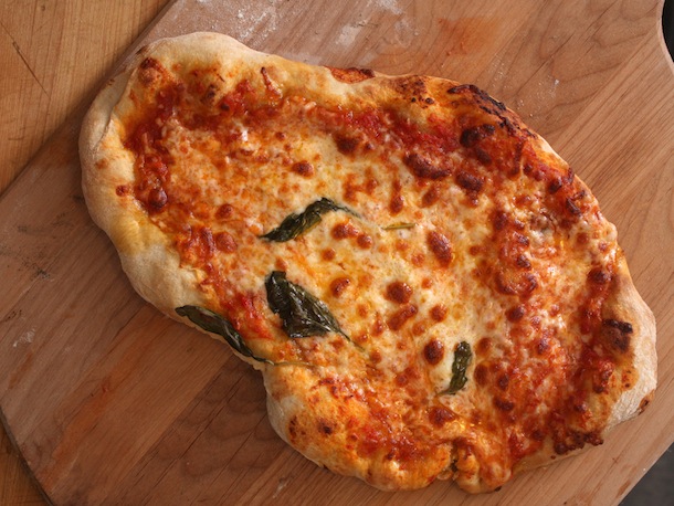
If you ordered a pizza, and opened the box to find this…

It wouldn’t matter how delicious the pizza actually was, right? You’d be pretty turned off. That’s because presentation matters–whether you’re eating pizza or reading a landing page.
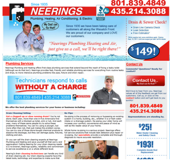
Too often, we see landing pages that look like this:

Image via Wishpond.
This wall of text makes it nearly impossible for the reader to gain a toehold in the copy. It takes extra effort and eye strain to read it.
And we all know that asking your reader to put in more effort can be a conversion-killer.
3 cardinal rules for formatting your landing page copy:
- Break text up into short paragraphs to make them easier to skim. We call this “chunking”. You can take this even further by using numbers or bullet points.
- Use headlines or larger type so users can scan down the page and quickly understand your message.
- Limit the width of the page copy to keep your reader’s eyes from getting tired. Reading back and forth on a wide page is annoying.
Another way to keep readers visually engaged is to alternate the presentation of copy and or copy + images down the page
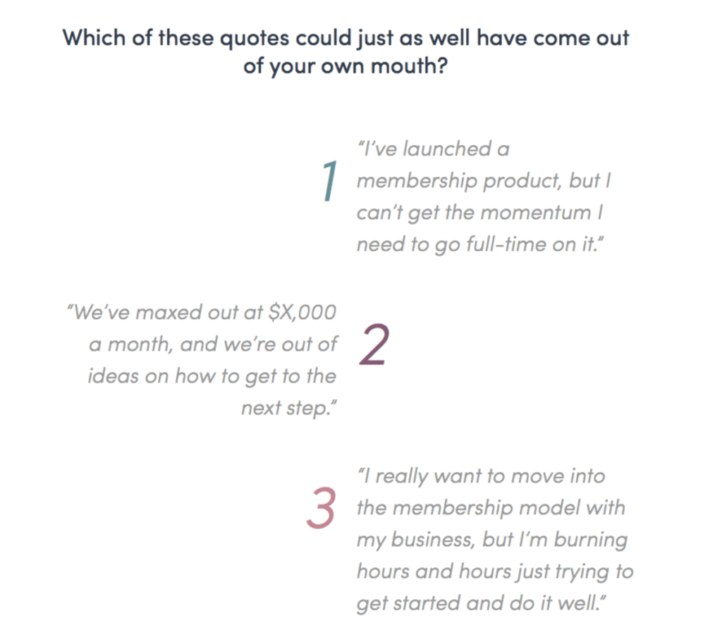
Think left, right, left, right, left, like MemberUp does:

MemberUp presents copy in chunks, and uses another excellent formatting trick: Numbers.

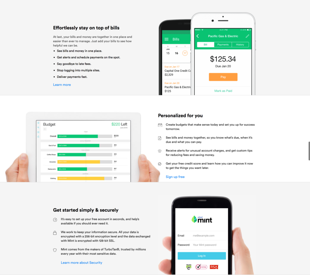
Mint.com takes the left-right-left alignment approach, and uses bullets to chunk text further.
Take a look at your landing page. Are you making your readers work too hard to read your copy?
The bullet-point wrapup
- Presentation matters. Focus on a clean, elegant landing page design that doesn’t distract from your message.
- Break up text into chunks and vary left-right alignment to keep your users’ eyes from getting tired.
- Try presenting copy in bullet points or numbered lists where appropriate.
Thanks for reading!
