A Picture Can Be Worth 1000 Conversions
This post is part of SNAP’s free 5-email Landing Page Optimization Series. Sign up here.
Let’s talk photos.
When you’re putting together your high-converting landing page, the last thing you want to do is leave your photos for last.
If you do, you risk relying on stock photos or low-quality shots that will lower belief in what you’re selling, hurt conversions, and make your page seem less trustworthy.
The risk of stock photos
One study found that users simply ignored stock photos, or those that were seen as “filler”.

Hat tip to UsersThink.com for its caption: “This person does not work for any website you see her on.”
Stock photos instantly communicate that:
- You’re not real or
- You didn’t care enough to use real photos.
Either way, they spark the dangerous question,
“Well, if the photos are fake, what else on this page should I disregard?”
Low-quality photos are just as bad as stock
Low-quality (AKA pixelated or grainy or badly lit or poorly framed) photos send the same message stock photos do: cheap, fake, not to be trusted.

This is a terrible photo. And would you believe the eBay seller hawking this lamp wants $3,500 for it?
It’s worth the time and expense to learn how to take excellent photos yourself, or hire a professional.
After all, when your page feels well-made and carefully put together, you’ll gain users’ trust (and maybe even access to their wallet).
What about graphics?
Graphics (generally, non-photo images that help illustrate what you’re offering) come with caveats, too.
Graphics are commonly used to help users understand exactly what you’re offering and show them exactly where to go, which is crucial when you only have a split second to catch your user’s attention.
In this case, they’re called “navigation graphics”.

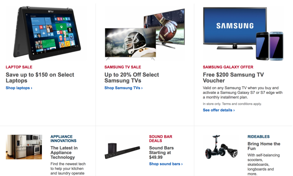
Best Buy uses navigation graphics to help users decide where to go.
When using graphics on your landing page, follow these basic rules:
- Simple and clear is better than overly detailed and distracting
- Be consistent with style–all graphics should look like they belong together
- If a graphic looks clickable, make sure it is
All of these visual elements build trust, so don’t overlook them
Graphics and photos can help users understand a process or product, and how it will benefit them.
Graphics and photos can ALSO build trust by allowing users to examine product details.
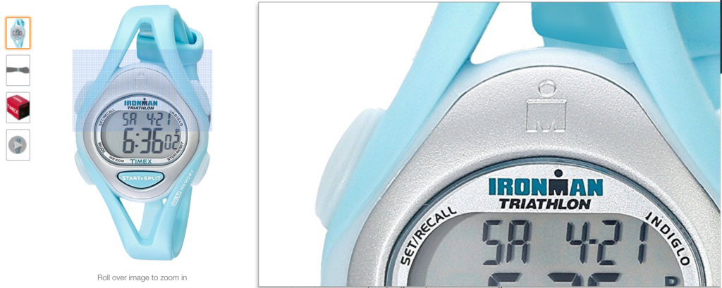
Any site that allows you to zoom in on a product, like Amazon, is building trust, since zooming in is the closest you can get to holding an online object in your hands.

Ever notice how you can zoom in on nearly any product on Amazon?
Even if your product is virtual, you can still offer a graphic representation of it.
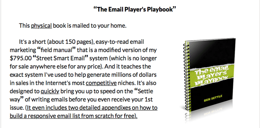
Consider e-book graphics, like Ben Settle’s “The Email Player’s Playbook”.

Via Ben Settle.
We know this “playbook” isn’t really a spiral-bound physical item, but the visual helps us understand the book’s length, and imagine the knowledge it contains.
The bullet-point wrapup
- Photos and graphics are just as important as copy, so don’t overlook them
- Stock photos and poor-quality photos can decrease trust and kill conversions
- Even if you have a virtual product, you can use graphics to illustrate and represent it
As always, thanks for reading!
